
To achieve the best results for your print jobs, you must understand how to prepare and submit your files. Sure, specific issues can arise on different print jobs, but most problems can be eliminated by adhering to best practices in your file prep. The following tips will help you avoid delays and increased costs!
1. Communicate with Your Print Partner
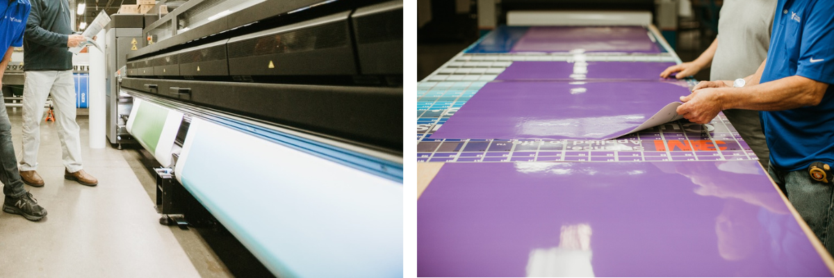
Your printing representative is a great resource for planning your print jobs. They can provide printed samples of previous jobs as well as paper types, ink draw downs, and more. These previews can give you a clear idea of what the finished product will look like. Your rep can also take you on a tour of the production facility where your project will be printed. A hands-on experience will cement your understanding of the printing and finishing process.
As a print partner, we can provide specific instructions to supply our pre-press department with the best art files in the appropriate format alongside any technical support necessary.
2. Adhere to Required File Guidelines
Different printing companies may have different requirements for preparing art files. The following file requirements are some of our preferences:
Software
- Files created in Adobe Illustrator with PDF compatibility are preferred.
- File types accepted: Adobe InDesign, Adobe Photoshop, ArtPro, Adobe PDF, and Esko Normalized PDF.
- Always be sure to include a PDF of your layout to provide a preview and allow for quality control.
Layout
- Create your file at 100% of the final print size. If your application does not allow this, you can set it up at 50%, 25% or 10%. Just be sure to note the scale used in the margin of the file or within the file name.
- Always include at least 0.25 inch bleed (at 100%) on all jobs! (This is most important with images that have been scanned.) Wall murals, windows, and other large projects may require up to 2 inches of bleed on all sides.
- All fonts and linked images should be included along with your source file. Both InDesign and Illustrator have a "Package" feature that can collect everything for you.
- Whenever possible, send an extra copy of your file with all text converted to outlines.
Color
- For printing, you should always supply art in CMYK color mode (plus any spot colors you will be printing).
- Spot colors must be indicated using PANTONE Matching System. Note that the accuracy of the color match will vary depending on the gamut of the printing method being used as well as the substrate being printed on.
- When identifying white in your file, you should create a spot color called "White Ink." Our processing equipment uses white ink for any spot color named "White Ink," so this streamlines the process. The swatch can have a color breakdown that is easily visible but not used elsewhere in the job. And be sure to include a note in your file margin specifying which visible color in your layout represents white ink.
- It's ideal to include a printed sample to match to.
Resolution/quality
- Preview your final design at full print size to check the art quality.
- Images should be provided at a minimum of 100ppi at full scale. If art is 1/2 scale, resolution should be 200ppi; 1/4 scale should be 400ppi; 1/10 scale should be 1000ppi. If you are unable to supply images at the proper resolution, contact your print rep for assistance.
Output
- As noted above, you should use the "collect for output" or "Package" feature within your software to output your files. This will guarantee that all files are submitted with the job.
- Supply any files created in layers along with the final artwork in case editing is necessary.
- Provide the final art file untrapped. Our prepress department will handle all trapping processes
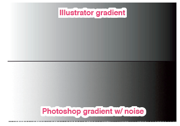
3. Prepare Gradients and Effects Properly
To avoid visible “banding” within any gradients, you should create gradients in Photoshop and add some noise. Gradients created in Illustrator often show banding or stepping.
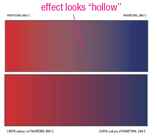
Also, try to avoid using Pantone colors with any types of effects or transparencies. Use the corresponding CMYK values to achieve more predictable results.
 .
. 
4. Double, Triple, Quadruple Check Your Files
This applies to you AND your printer. Check all dates, times, and small details thoroughly when you receive the proof of your artwork. Attention to detail is critical to avoid additional production time and financial costs. Any mistakes that aren't caught at the proof stage can mean reprinting the project—which would tank both your deadlines and your budget.
Following these best practices should help ensure the best results for your print projects! Contact us to get started on your next project.